本文将继续使用兰花空间转录组的数据,同时运用文献中提到的 STEEL 聚类方法进行分析,该方法也是由戚继团队开发的,看文章感觉聚类效果不错。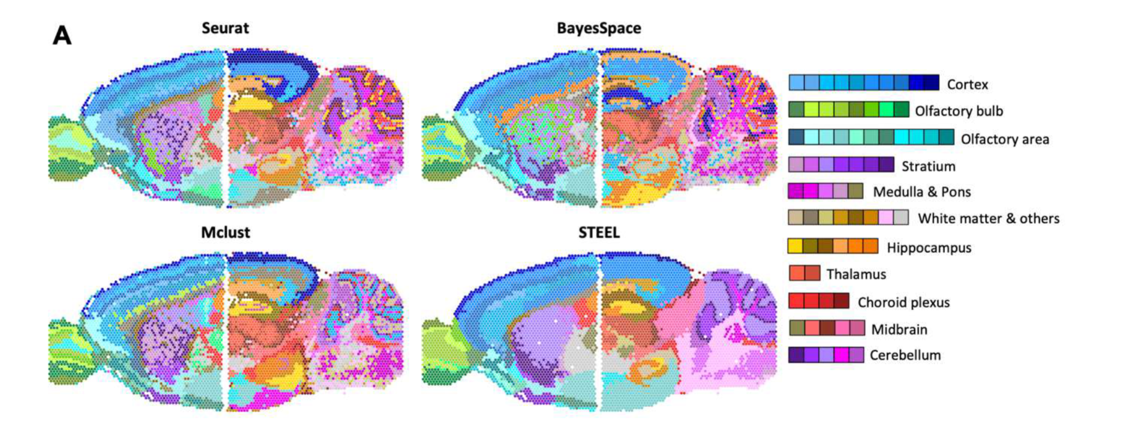
目前该文章还未被接收,大家可以先用下软件,主要能提供聚类信息和每个聚类的 marker 基因,但个人认为可视化方面还有所欠缺,所以这个教程将结合 STEEL 的聚类方法与 Seurat 的可视化函数来完整复现文章的聚类图和拟时图
# STEEL 聚类分析
软件下载 STEEL (sourceforge.io)
使用说明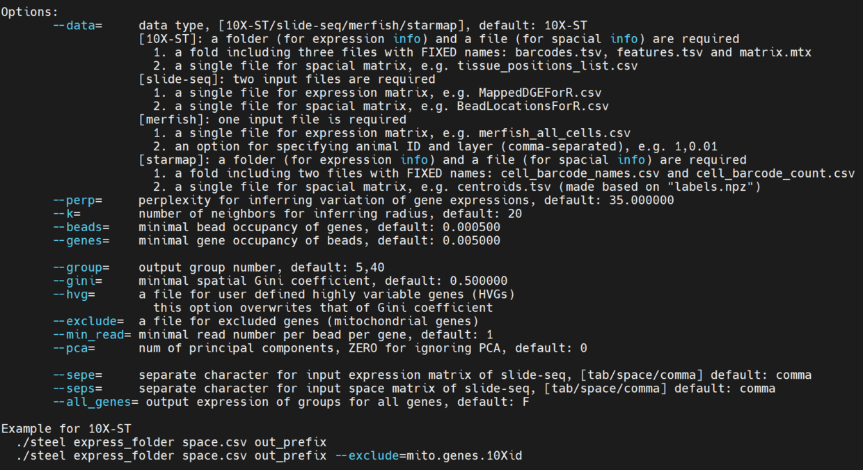
主要的参数就是 --beads --genes --pca --group
./steel filtered_feature_bc_matrix spatial/tissue_positions_list.csv --pca=20 pca20out |
输出结果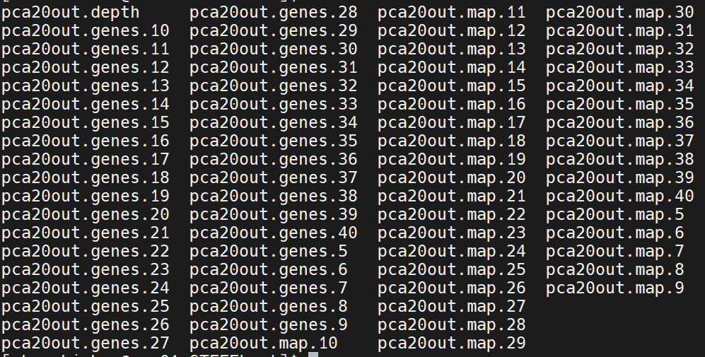
genes 文件里面包含的就是聚类特异基因,map 文件就是聚类信息,我们使用 pca20out.map.40 的聚类信息进行后续的分析
# Seurat 聚类图
使用 Seurat 读取原始的数据,并将 STEEL 聚类信息读入
library (Seurat) | |
library (dplyr) | |
library (ggplot2) | |
library (magrittr) | |
library (cowplot) | |
library (gtools) | |
library (stringr) | |
library (Matrix) | |
library (tidyverse) | |
library (patchwork) | |
orc1<- Load10X_Spatial ("Slide_1") | |
## 直接导入 STEEL 的聚类信息 | |
STEEL<- read.delim ("STEEL/Slide1.map.40",row.names = 1) | |
orc1 [["seurat_clusters"]] <- NA | |
clusters<-data.frame (STEEL$Cluster) | |
rownames (clusters) <- rownames (STEEL) | |
orc1 [["seurat_clusters"]][rownames (clusters),] <- clusters | |
## 去除 NA 值只保留有聚类的 | |
orc1_new <- orc1 [,rownames (clusters)] | |
Idents (orc1_new) <- 'seurat_clusters' | |
Idents (orc1_new) <- factor (Idents (orc1_new),levels=mixedsort (levels (Idents (orc1_new)))) |
接下来就是利用 SpatialDimPlot 绘制聚类图了
orc1_new <- SCTransform(orc1_new, assay = "Spatial", return.only.var.genes = FALSE, verbose = FALSE) | |
orc1_new <- RunPCA(orc1_new, features = VariableFeatures(orc1_new)) | |
orc1_new <- RunTSNE(orc1_new, dims = 1:20) | |
p1 <- DimPlot(orc1_new, reduction = "tsne", label = TRUE) | |
p2 <- SpatialDimPlot(orc1_new, group.by = "seurat_clusters",label.size = 3, pt.size.factor = 1.3) | |
pearplot <- plot_grid(p1,p2) | |
ggsave("STEEL/tsne_Slide1_40.pdf", plot = pearplot, width = 6, height = 6) |
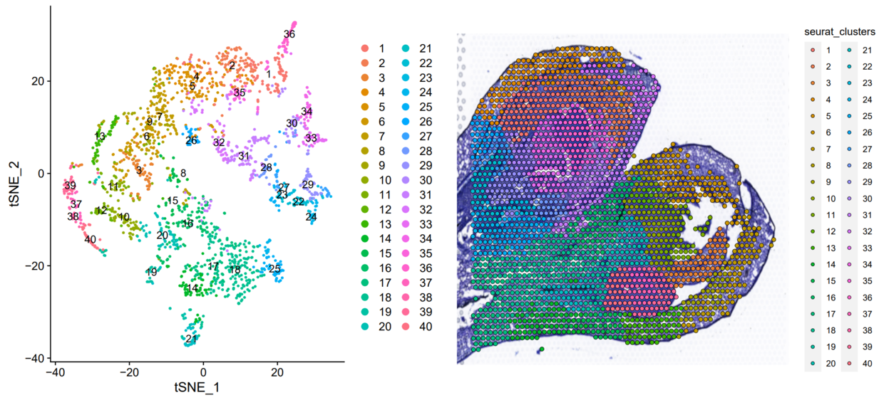
这个结果其实已经和原文一模一样了,就是颜色不对应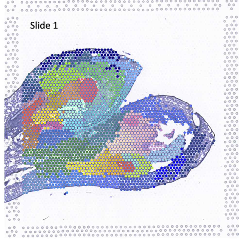
单看某个聚类对应关系,完全一致
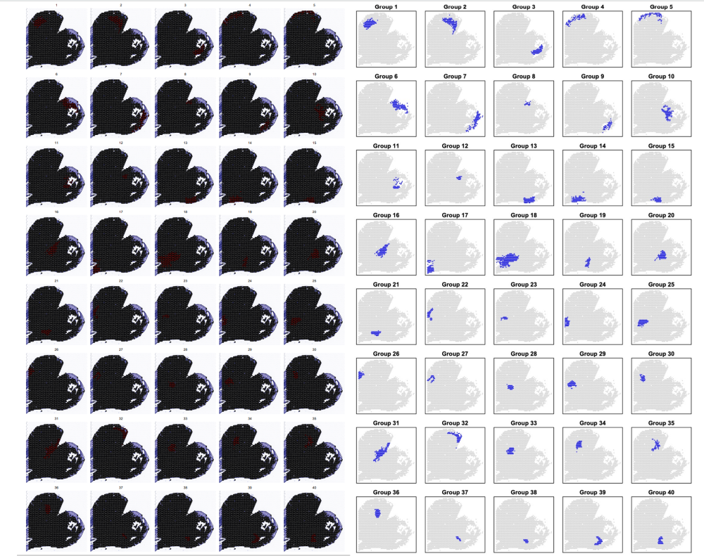
p1<- SpatialDimPlot(orc1_new, cells.highlight = CellsByIdentities(object = orc1_new, idents = c(1:40)), facet.highlight = TRUE, ncol = 5) | |
ggsave("STEEL/cluster_Slide1all.pdf", plot = p1, width = 19, height = 12) |
对应好聚类关系接下就是拟时分析了
# 拟时分析
在文章中做了两次拟时分析,本次分析只以 Fig2 的组织进行分析,其他的大家也可以自尝试
library (monocle) | |
subdata <- subset (orc1_new, idents = c (19,21,37,38,39,40)) | |
# 选择要分析的亚群 | |
expression_matrix = subdata@assays$Spatial@counts | |
cell_metadata <- data.frame (group = subdata [['orig.ident']],clusters = Idents (subdata)) | |
gene_annotation <- data.frame (gene_short_name = rownames (expression_matrix), stringsAsFactors = F) | |
rownames (gene_annotation) <- rownames (expression_matrix) | |
pd <- new ("AnnotatedDataFrame", data = cell_metadata) | |
fd <- new ("AnnotatedDataFrame", data = gene_annotation) | |
HSMM <- newCellDataSet (expression_matrix, | |
phenoData = pd, | |
featureData = fd, | |
expressionFamily=negbinomial.size ()) | |
HSMM <- detectGenes (HSMM,min_expr = 0.1) | |
HSMM_myo <- estimateSizeFactors (HSMM) | |
HSMM_myo <- estimateDispersions (HSMM_myo) | |
disp_table <- dispersionTable (HSMM_myo) | |
disp.genes <- subset (disp_table, mean_expression >= 0.1 ) | |
disp.genes <- as.character (disp.genes$gene_id) | |
HSMM_myo <- reduceDimension (HSMM_myo, max_components = 2, method = 'DDRTree') | |
HSMM_myo <-orderCells (HSMM_myo,reverse = T) | |
#State 轨迹分布图 | |
plot1 <- plot_cell_trajectory (HSMM_myo, color_by = "State") | |
##Cluster 轨迹分布图 | |
plot2 <- plot_cell_trajectory (HSMM_myo, color_by = "clusters") | |
##Pseudotime 轨迹图 | |
plot3 <- plot_cell_trajectory (HSMM_myo, color_by = "Pseudotime") | |
plotc <- plot1|plot2|plot3 | |
ggsave ("STEEL/Combination1.pdf", plot = plotc, width = 18, height = 6.2) | |
# 绘制拟时间 | |
cell_Pseudotime <- data.frame (pData (HSMM_myo)$Pseudotime) | |
rownames (cell_Pseudotime) <- rownames (cell_metadata) | |
# 把拟时间对应到到组织切片位置上 | |
orc1_new [['Pseudotime']] <- NA | |
orc1_new [['Pseudotime']][rownames (cell_Pseudotime),] <- cell_Pseudotime | |
p1 <- SpatialFeaturePlot (orc1_new, features = c ("Pseudotime"),pt.size.factor = 1.3) | |
ggsave ("STEEL/pseudotime_feature1.pdf", plot = p1, width = 8, height = 9) |
主要的亮点就在于可以把拟时结果体现在我们的组织切片上,这样我们在 orderCells 这一步可以更加方便的判断每个 spot 的拟时间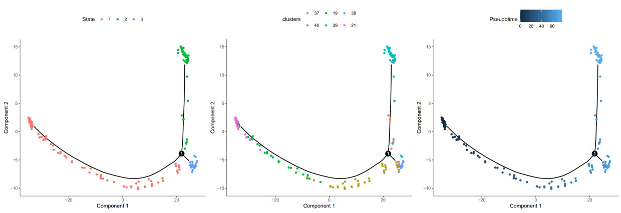
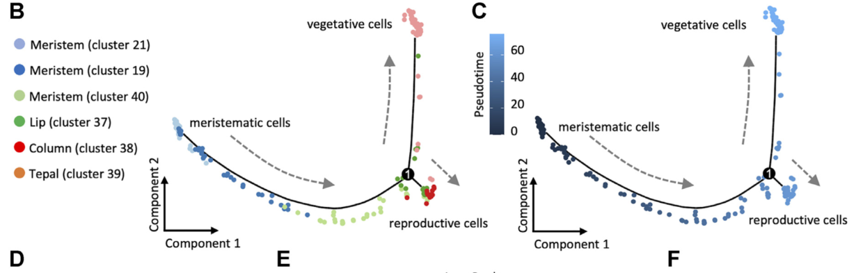
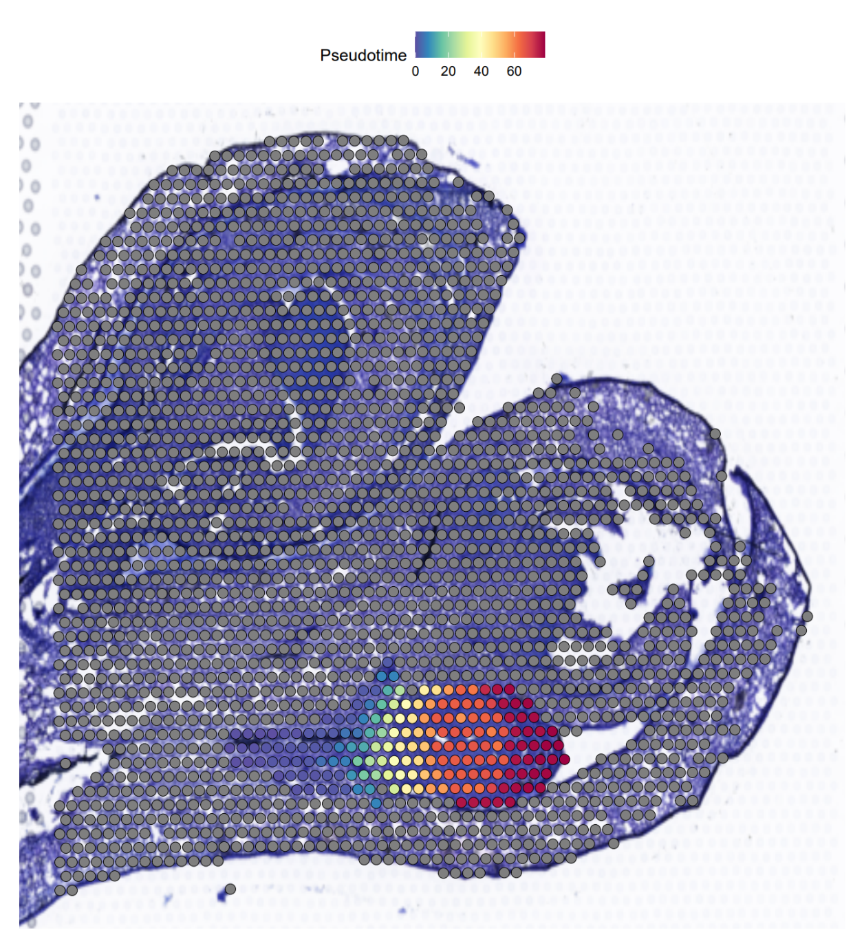
可以看到和文章里的是一模一样的,接下来就是复现文章中的基因拟时分布和 BEAM 结果
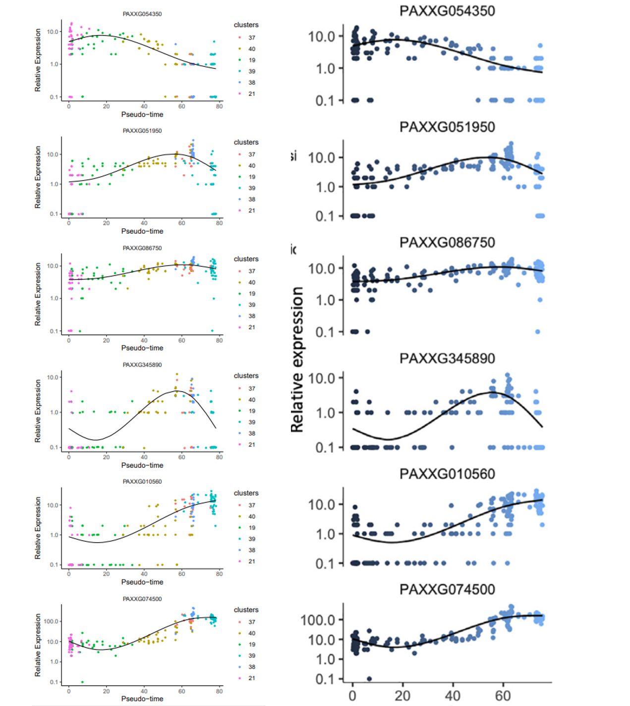
data_subset <- HSMM_myo ['PAXXG054350',] | |
p1<-plot_genes_in_pseudotime (data_subset, color_by = "clusters") | |
data_subset <- HSMM_myo ['PAXXG051950',] | |
p2<-plot_genes_in_pseudotime (data_subset, color_by = "clusters") | |
data_subset <- HSMM_myo ['PAXXG086750',] | |
p3<-plot_genes_in_pseudotime (data_subset, color_by = "clusters") | |
data_subset <- HSMM_myo ['PAXXG345890',] | |
p4<-plot_genes_in_pseudotime (data_subset, color_by = "clusters") | |
data_subset <- HSMM_myo ['PAXXG010560',] | |
p5<-plot_genes_in_pseudotime (data_subset, color_by = "clusters") | |
data_subset <- HSMM_myo ['PAXXG074500',] | |
p6<-plot_genes_in_pseudotime (data_subset, color_by = "clusters") #color_by 可以换成 state 或者 pseudotime | |
pearplot <- plot_grid (p1,p2,p3,p4,p5,p6,align = "v",axis = "b",ncol = 1) | |
ggsave ("STEEL/gene_pseudotime1.pdf", plot = pearplot, width = 5, height = 15) | |
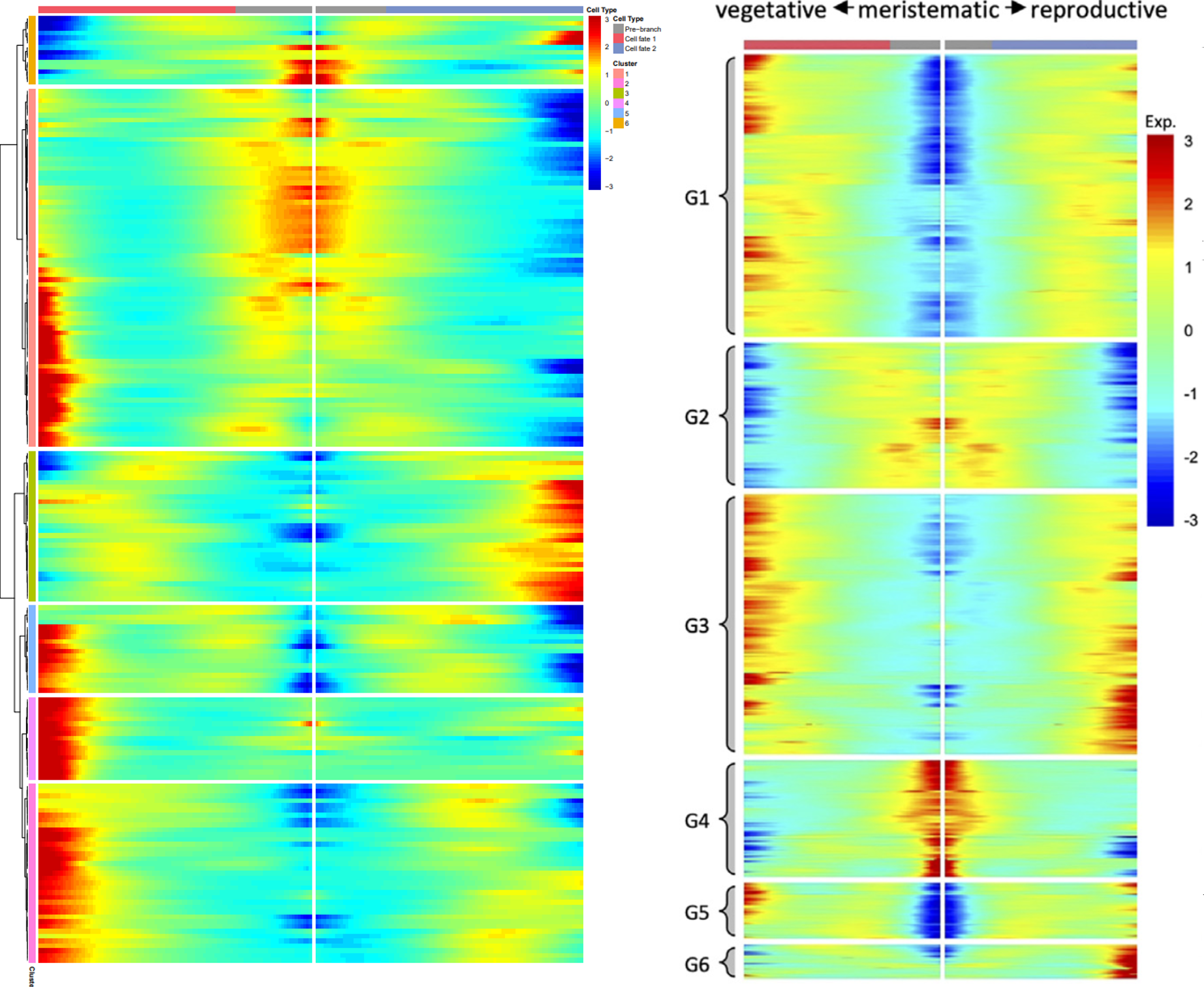
# 拟时相关基因聚类热图 | |
disp_table <- dispersionTable (HSMM_myo) | |
disp.genes <- subset (disp_table, mean_expression >= 0.5&dispersion_empirical >= 1*dispersion_fit) | |
disp.genes <- as.character (disp.genes$gene_id) | |
mycds_sub <- HSMM_myo [disp.genes,] | |
diff_test <- differentialGeneTest (HSMM_myo [disp.genes,], cores = 4, | |
fullModelFormulaStr = "~sm.ns (Pseudotime)") | |
sig_gene_names <- row.names (subset (diff_test, qval < 1e-04)) | |
p2 = plot_pseudotime_heatmap (HSMM_myo [sig_gene_names,], num_clusters=6, | |
show_rownames=F, return_heatmap=T) | |
ggsave ("STEEL/pseudotime_heatmap1.pdf", plot = p2, width = 5, height = 10) | |
## BEAM 分析 | |
my_pseudotime_de <- differentialGeneTest (HSMM_myo, cores = 5) | |
BEAM_res <- BEAM (HSMM_myo, branch_point = 1, cores = 4) | |
BEAM_res <- BEAM_res [order (BEAM_res$qval),] | |
BEAM_res <- BEAM_res [,c ("gene_short_name", "pval", "qval")] | |
mycds_sub_beam <- HSMM_myo [row.names (subset (BEAM_res, qval < 1e-4)),] | |
pdf ("STEEL/BEAM1.pdf", width = 8, height = 12) | |
plot_genes_branched_heatmap (mycds_sub_beam, branch_point = 1, num_clusters = 6, cores = 4,show_rownames = FALSE) | |
dev.off () |
可以看到 BEAM 不太相同,但除了这个以外其他的都是完全一致,这次分析达到了文章中的效果,比较满意
#总结
目前植物空间转录组刚刚起步,相信今年会有很多文章出现,到时候主要就是看创新点在哪,能解决什么问题