空间转录组是 2022 生命科学十大创新产品名单,因此将来会在生物学领域有非常大的应用空间,目前植物类的相关文章较少,在本次的系列教程中,将使用复旦大学戚继团队兰花空间转录组的数据,希望大家一起学习,掌握植物空间转录组基本的分析方法
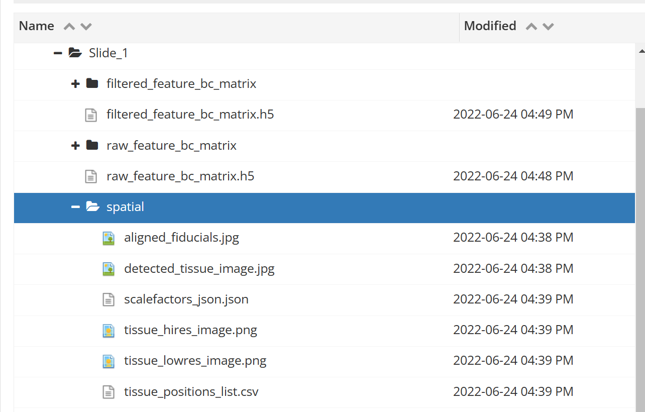
数据连接 OSF | Spatiotemporal atlas of organogenesis in development of orchid flowers, 与单细胞的数据结构基本一致,多了 spatial 这个文件夹,主要包含的就是切片信息和 spot 定位信息

# 前言
在本篇文章中,作者一共制作了兰花空间转录组切片,并使用了 STEEL 方法进行聚类,出于学习考虑,本次分析先使用 Seurat 的常见流程分析其中一个切片,后续推文中将使用文章中的 STELL 方法进行聚类并使用 Seurat 的其他函数进行后续分析
本次只分析 Slide1,感兴趣的可以试试其他切片
# 数据载入
和单细胞一样,只是多了 spatial 这个文件夹需要输入
##=============================1. 安装依赖包 ===================================== | |
##BiocManager::install (c ('Seurat','ggplot2','cowplot','dplyr')) | |
##BiocManager::install ("monocle",force = TRUE) | |
library (Seurat) | |
library (ggplot2) | |
library (cowplot) | |
library (dplyr) | |
library (magrittr) | |
library (gtools) | |
library (stringr) | |
library (Matrix) | |
library (tidyverse) | |
library (patchwork) | |
##=============================2. 载入数据 ======================================= | |
orc1<- Load10X_Spatial ("Slide_1",filename = "filtered_feature_bc_matrix.h5",assay = "spatial") |
# 质量控制
不只是能体现小提琴图,还能将每个 spot 的测序质量体现在切片上,帮我们确定哪些组织可能会出现问题
##=============================3. 质量控制 ======================================= | |
dir.create ("QC") | |
##UMI 统计画图 | |
plot1 <- VlnPlot (orc1, features = "nCount_Spatial", pt.size = 0.1) + NoLegend () | |
plot2 <- SpatialFeaturePlot (orc1, features = "nCount_Spatial") + theme (legend.position = "right") | |
pearplot <- plot_grid (plot1,plot2) | |
ggsave ("QC/Slide1_UMI.pdf", plot = pearplot, width = 12, height = 5) | |
##Feature/Gene 统计画图 | |
plot1 <- VlnPlot (orc1, features = "nFeature_Spatial", pt.size = 0.1) + NoLegend () | |
plot2 <- SpatialFeaturePlot (orc1, features = "nFeature_Spatial") + theme (legend.position = "right") | |
pearplot <- plot_grid (plot1,plot2) | |
ggsave ("QC/Slide1_Feature.pdf", plot = pearplot, width = 12, height = 5) |
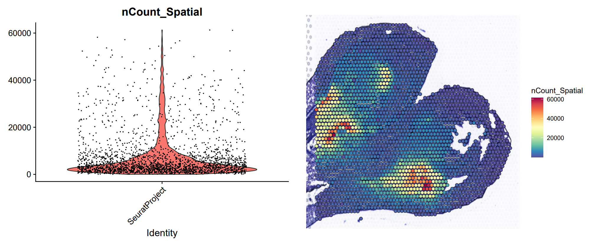
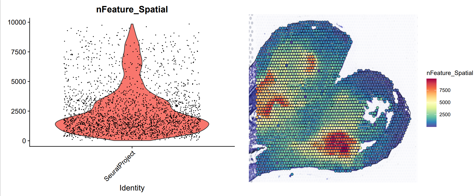
可以明显的看到,不管是 UMI 还是 Feature,在 spot 中差异主要是有与切片组织的细胞数目以及细胞类型导致的。比如,在花瓣中可以看到非常少的 UMI 以及 Feature,在中间的分生组织中,UMI 和 Feature 的数目非常多。因此,单细胞的标准方法 (如 LogNormalize 函数) 可能会有问题,在空间转录组分析中,一般使用其他方法进行标准化。
# 数据标准化
目前空间转录组数据推荐使用 sctransform,具体的原理我还没有看懂,所以先根据流程走一遍,看看效果
为了探究标准化方法的不同,sctransform 和 log 规范化结果如何与 UMIs 的数量相关。为了进行比较,首先运行 sctransform 来存储所有基因的值,并通过 NormalizeData 运行一个 log 规范化过程。
##============================4. 数据标准化 ====================================== | |
## 目前空间转录组推荐使用 SCTransform,集合了单细胞标准化的 NormalizeData (),ScaleData (),FindVariableFeatures (), | |
dir.create ("Normalize") | |
orc1 <- SCTransform (orc1, assay = "Spatial", return.only.var.genes = FALSE, verbose = FALSE) | |
## 比较 SCTransform 与 log Normalization 的区别 | |
orc1 <- NormalizeData (orc1, verbose = FALSE, assay = "Spatial") | |
## 计算 UMI 与 Feature 的相关性,分为 5 组 | |
orc1 <- GroupCorrelation (orc1, group.assay = "Spatial", assay = "Spatial", slot = "data", do.plot = FALSE) | |
orc1 <- GroupCorrelation (orc1, group.assay = "Spatial", assay = "SCT", slot = "scale.data", do.plot = FALSE) | |
p1 <- GroupCorrelationPlot (orc1, assay = "Spatial", cor = "nCount_Spatial_cor") + ggtitle ("Log Normalization") + | |
theme (plot.title = element_text (hjust = 0.5)) | |
p2 <- GroupCorrelationPlot (orc1, assay = "SCT", cor = "nCount_Spatial_cor") + ggtitle ("SCTransform Normalization") + | |
theme (plot.title = element_text (hjust = 0.5)) | |
p3 <- plot_grid (p1, p2) | |
ggsave ("Normalize/Normalization_cor_Slide1.pdf", plot = p3, width = 12, height = 5) |
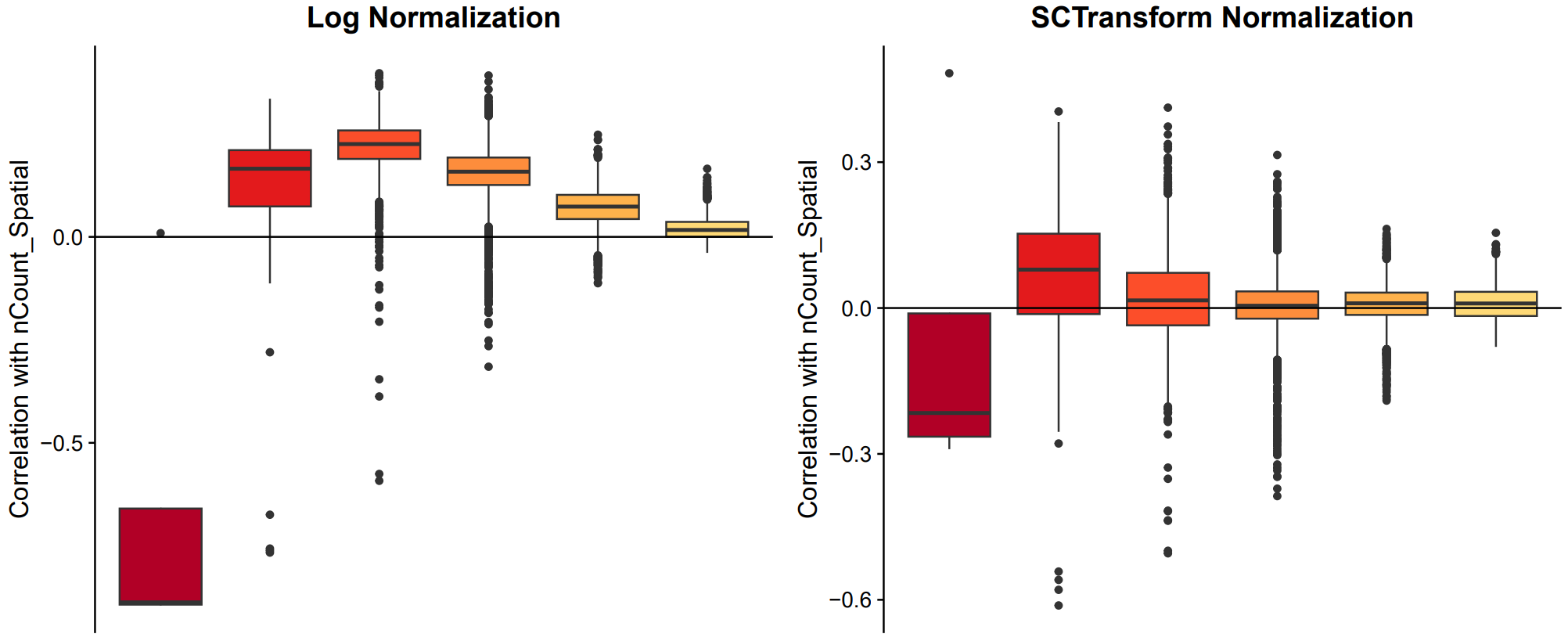
对于上面的箱形图,计算每个特征 (基因) 与 UMIs 数量 (这里的 nCount_Spatial 变量) 的相关性。然后,根据基因的平均表达将它们分组,并生成这些相关性的箱形图。
同时这里需要注意,SCT 标准化后有个单独的 assay (SCT),里面包含三个矩阵,分别为 count,data 以及 scale.data,log 标准化也有一个 assay (Spatial),里面也包含三个矩阵,但是 scale.data 的数据为 0
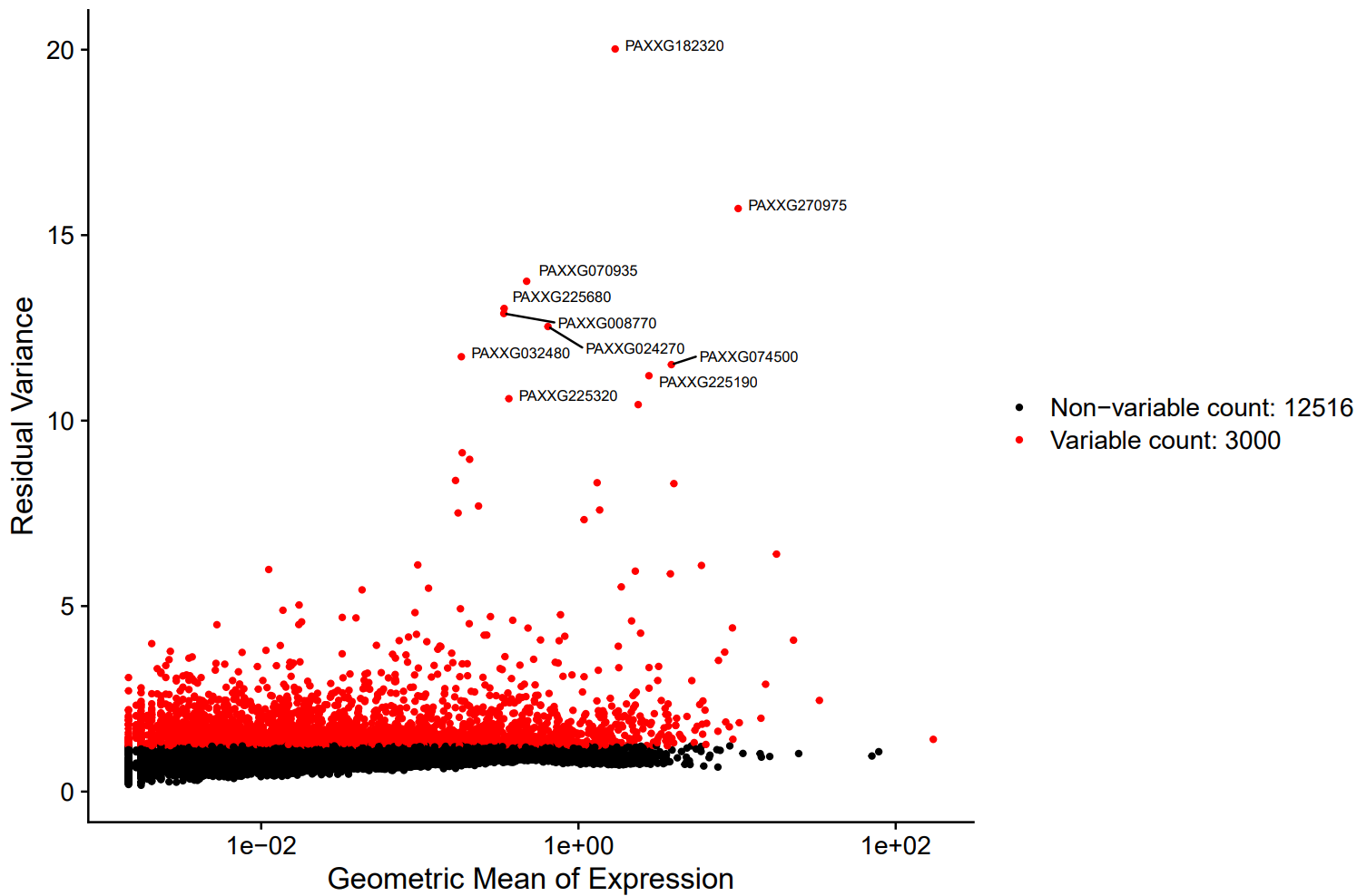
标准化之后进行高变基因的筛选,这部分没什么可说的,与单细胞是一致的
top10 <- head(VariableFeatures(orc1), 10)
plot1 <- VariableFeaturePlot(orc1)
plot2 <- LabelPoints(plot = plot1, points = top10, repel = TRUE, size=2.5)
ggsave("Normalize/VariableFeature_Slide1.pdf", plot = plot2, width = 9, height = 6)
# 数据降维与聚类
由于文章中使用了 STEEL 方法,所以这次的分析只是走走流程,之后会按照文章中的 STEEL 方法进行测试
##============================5. 数据降维与聚类 ================================== | |
dir.create ("cluster") | |
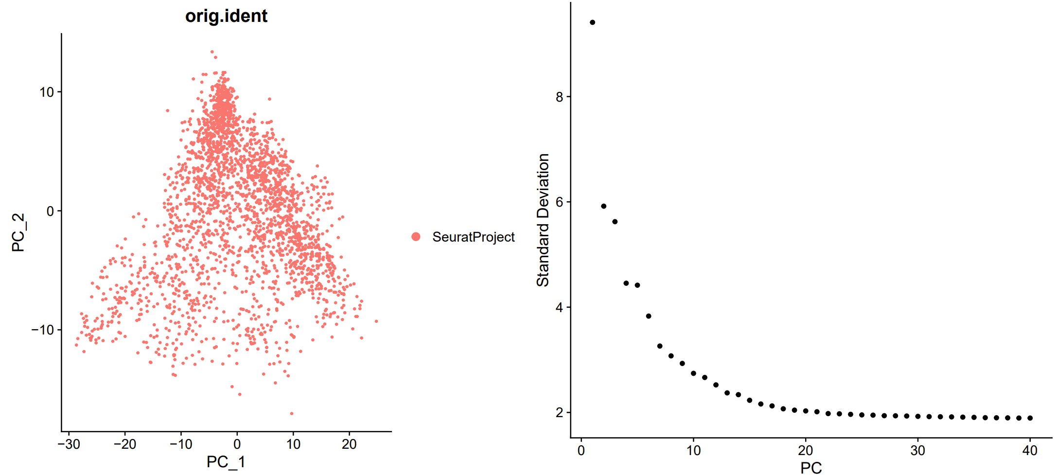
## PCA 降维并提取主成分 | |
orc1 <- RunPCA (orc1, features = VariableFeatures (orc1_new)) | |
plot1 <- DimPlot (orc1, reduction = "pca", group.by="orig.ident") | |
plot2 <- ElbowPlot (orc1, ndims=40, reduction="pca") | |
pearplot <- plot_grid (plot1,plot2) | |
ggsave ("cluster/PCA_Slide1.pdf", plot = pearplot, width = 13, height = 6) | |
pdf ("cluster/PC_heatmap_Slide1.pdf",height = 12,width = 12) | |
DimHeatmap (orc1, dims = 1:9, nfeatures=10, cells = 200, balanced = TRUE) | |
dev.off () | |
## 细胞聚类 | |
## 此步利用 细胞 - PC 值 矩阵计算细胞之间的距离, | |
## 然后利用距离矩阵来聚类。其中有两个参数需要人工选择, | |
## 第一个是 FindNeighbors () 函数中的 dims 参数,需要指定哪些 pc 轴用于分析,选择依据是之前介绍的 cluster/pca.png 文件中的右图。 | |
## 第二个是 FindClusters () 函数中的 resolution 参数,需要指定一个数值,用于决定 clusters 的相对数量,数值越大 cluters 越多。 | |
orc1 <- FindNeighbors (orc1, dims = 1:20) | |
orc1 <- FindClusters (orc1, resolution = 0.9) | |
metadata <- orc1@meta.data | |
table (orc1@meta.data$seurat_clusters) | |
cell_cluster <- data.frame (cell_ID=rownames (metadata), cluster_ID=metadata$seurat_clusters) | |
write.csv (cell_cluster,'cluster/cell_cluster_Slide1.csv',row.names = F) |
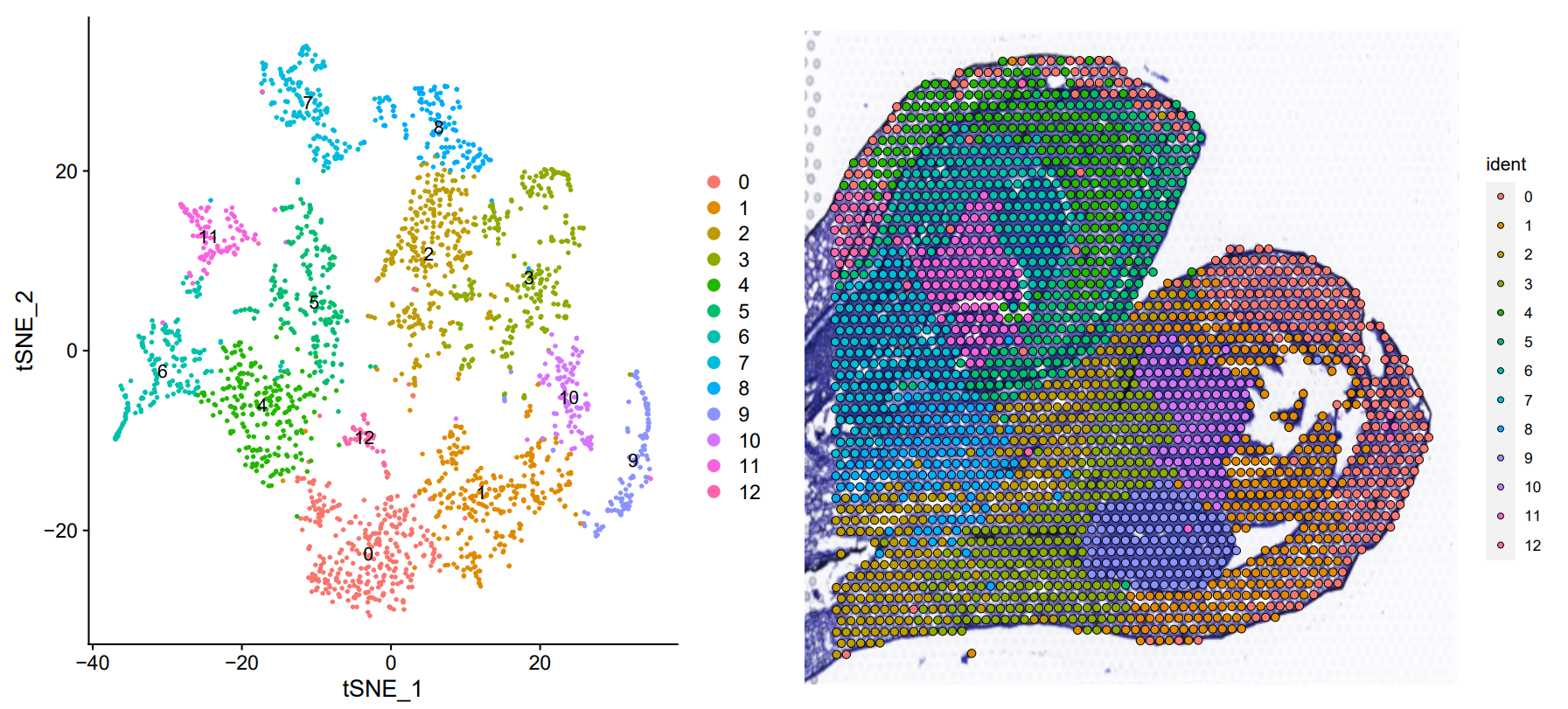
使用 resolution = 0.9 只生成了 12 个聚类,原文中有 40 个,大家在设置的时候可以把 resolution 调到 2 甚至 3 左右看看效果
## 非线性降维 | |
## tsne | |
orc1 <- RunTSNE (orc1, dims = 1:20) | |
embed_tsne <- Embeddings (orc1, 'tsne') | |
write.csv (embed_tsne,'cluster/embed_tsne_Slide1.csv') | |
p1 <- DimPlot (orc1, reduction = "tsne", label = TRUE) | |
p2 <- SpatialDimPlot (orc1, label.size = 3, pt.size.factor = 1.3) | |
pearplot <- plot_grid (p1,p2) | |
ggsave ("cluster/tsne_Slide1.pdf", plot = p2, width = 6, height = 6) | |
## UMAP | |
orc1 <- RunUMAP (orc1,dims = 1:20) | |
embed_umap <- Embeddings (orc1, 'umap') | |
write.csv (embed_umap,'cluster/embed_umap_Slide1.csv') | |
p1 <- DimPlot (orc1, reduction = "umap", label = TRUE) | |
p2 <- SpatialDimPlot (orc1, label = TRUE, label.size = 3, pt.size.factor = 1.3) | |
pearplot <- plot_grid (p1,p2) | |
ggsave ("cluster/umap_Slide1.pdf", plot = pearplot, width = 13, height = 6) |

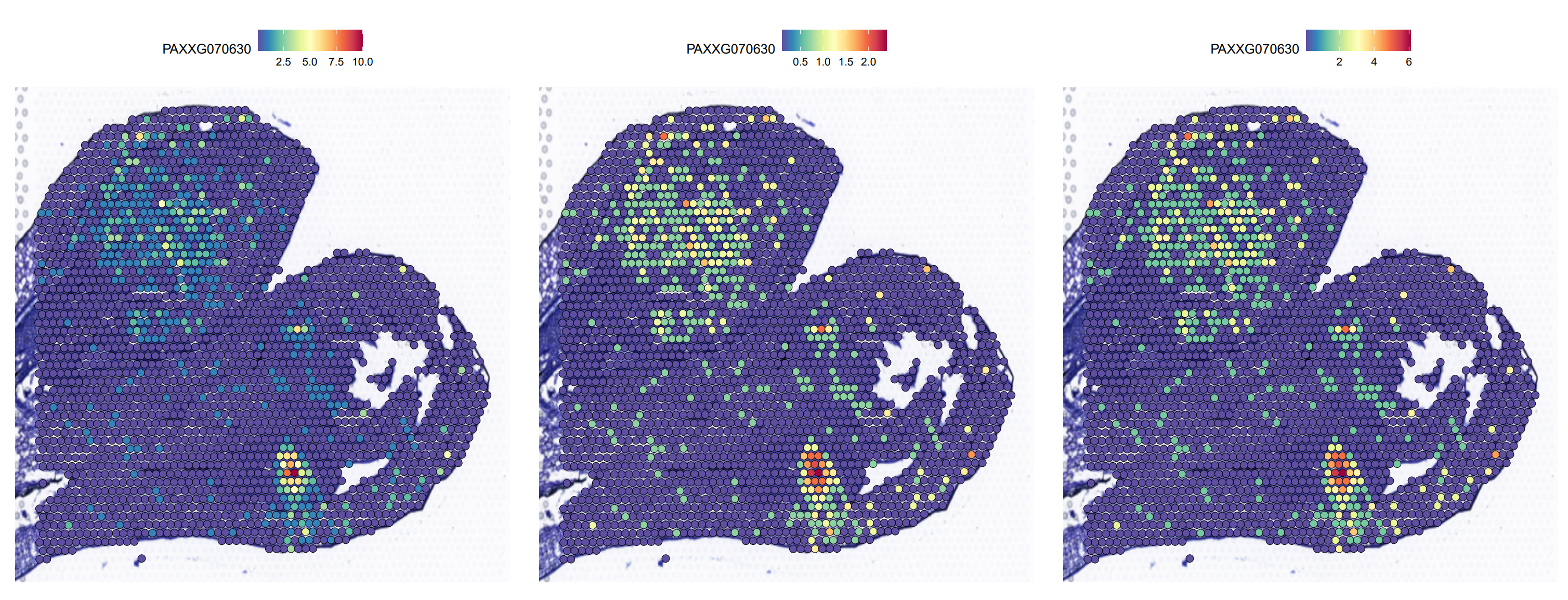
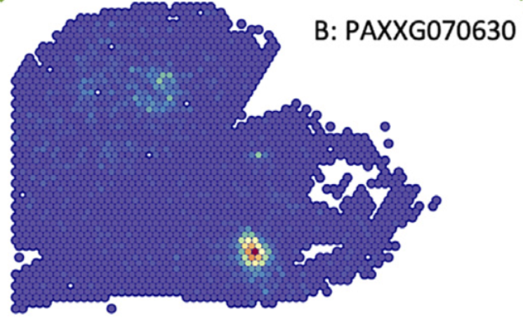
#6. 部分基因展示
此处是我比较纠结的地方,因为一开始得到的数据和原文中有点不符,后来发现可能的原因是文章中使用的展示数据是 counts
## featureplot | |
dir.create("featureplot") | |
p1 <- SpatialFeaturePlot(orc1, features = "PAXXG070630",slot="counts",pt.size.factor = 1.6,min.cutoff = 0.1) | |
p2 <- SpatialFeaturePlot(orc1, features = "PAXXG070630",slot="data",pt.size.factor = 1.6,min.cutoff = 0.1) | |
p3 <- SpatialFeaturePlot(orc1, features = "PAXXG070630",slot="scale.data",pt.size.factor = 1.6,min.cutoff = 0.1) | |
pearplot <- plot_grid(p1,p2,p3,align = "v",axis = "b",ncol = 3) | |
ggsave("featureplot/SCTSlide1.pdf", plot = pearplot, width = 18, height = 7) |
#总结
目前先把前期的工作的进行了一下,原文中进行了两个拟时分析,但因为聚类不一样所以先不进行分析,研究完 STEEL 之后再进行拟时分析。
总体来讲与单细胞变化不大,有优势也有劣势吧,对于细胞分型来说,空间转录组有先天优势,可以直接根据切片信息判断细胞类型,但是空间转录组最小的单位 spot,不能代表单个细胞,分辨率可能还存在问题